
The year-over-year report places two performances or two seasons side by side so you can see exactly where this year's numbers differ from last year's — in both absolute and percentage terms.
Go to Admin → Venues → [your venue] → Reports → Year-over-year.
Choosing what to compare
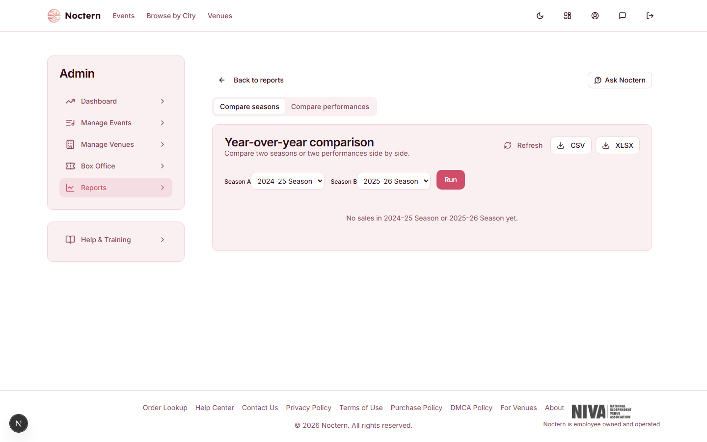
Use the Compare seasons / Compare performances toggle at the top, then pick from the dropdowns for that mode — never typed IDs:
- Compare seasons — pick two of your defined venue seasons to compare aggregated totals. The report opens with your previous season vs. your current season already selected and run.
- Compare performances — pick two occurrences from the dropdowns (listed by date and title) to compare the same series across two different dates (e.g., the 2025 run of a show vs. the 2026 run).
Switching the toggle swaps which pair of dropdowns is shown; the other pair's selection is cleared.
Metrics compared
The side-by-side table shows the same columns as the Performance Summary — capacity, paid, comp, % sold, gross revenue, net revenue, discounts, and refunds — for both periods; gross revenue is Noctern-native sales only, with imported-history face value shown as its own row rather than added in. Two additional columns show:
- Δ (absolute) — the raw difference between the two periods
- Δ% — the percentage change
Positive deltas are shown in green; negative in red.
Sales-pace curve
Below the comparison table, a dual-line chart shows cumulative tickets sold by days before the event for each period. This reveals whether you sold faster or slower this year relative to the same point in the pre-event window — useful for deciding whether a current show needs promotional support.
Exporting
Click Download XLSX to export the full comparison. The XLSX includes both the summary table and the sales-pace data.
The YoY report is most useful after a show has closed, when you can compare two completed runs. For an in-progress show, use the Sell-through & Pace marketing report to see where you are in real time relative to prior pacing.